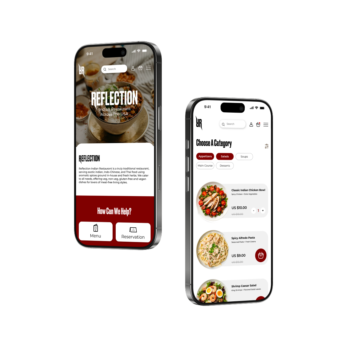
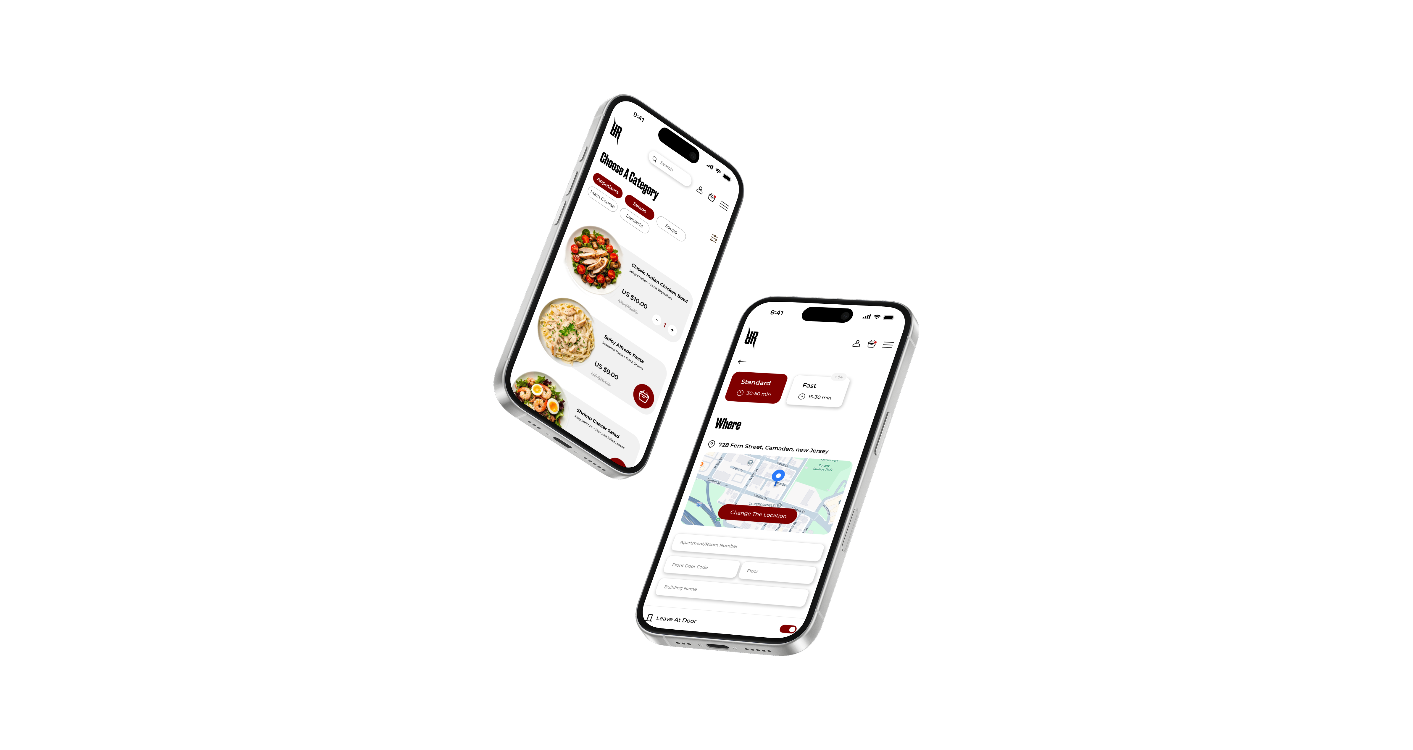
Reflection
Services:
Website Design
Year:
2025
Project Overview
Restaurant mobile app, with hard navigation and poor design. Since I decided to do new research for this app and absolutely change the design, it will help to make the app usable and easy to navigate.
Research Goals
Understand users needs, find main pain points in existing design, explore frustrations users currently face with restaurant apps, determine cultural and dietary considerations, identify what users consider a successful app experience (quick reordering, accurate delivery, easy customization, good UI for browsing dishes by category).
Scope of Work
- Web app redesign and development.
- Accessibility Design.
- UX/UI optimization.
- Whole web app rebranding.
Challange
"How might we redesign a simple, trustworthy Indian food app that helps users easily customize their orders and discover authentic dishes?"
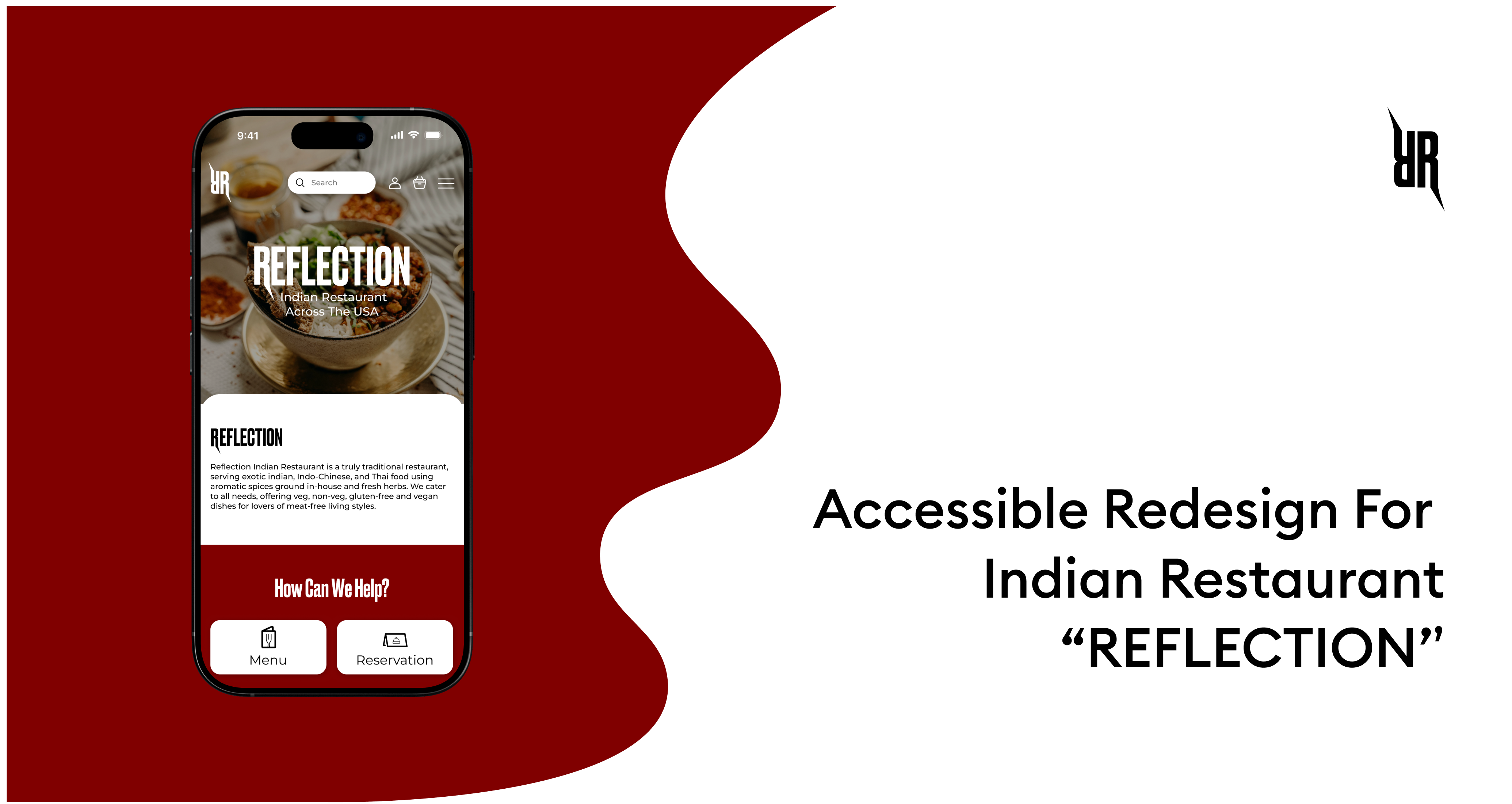
About the Project
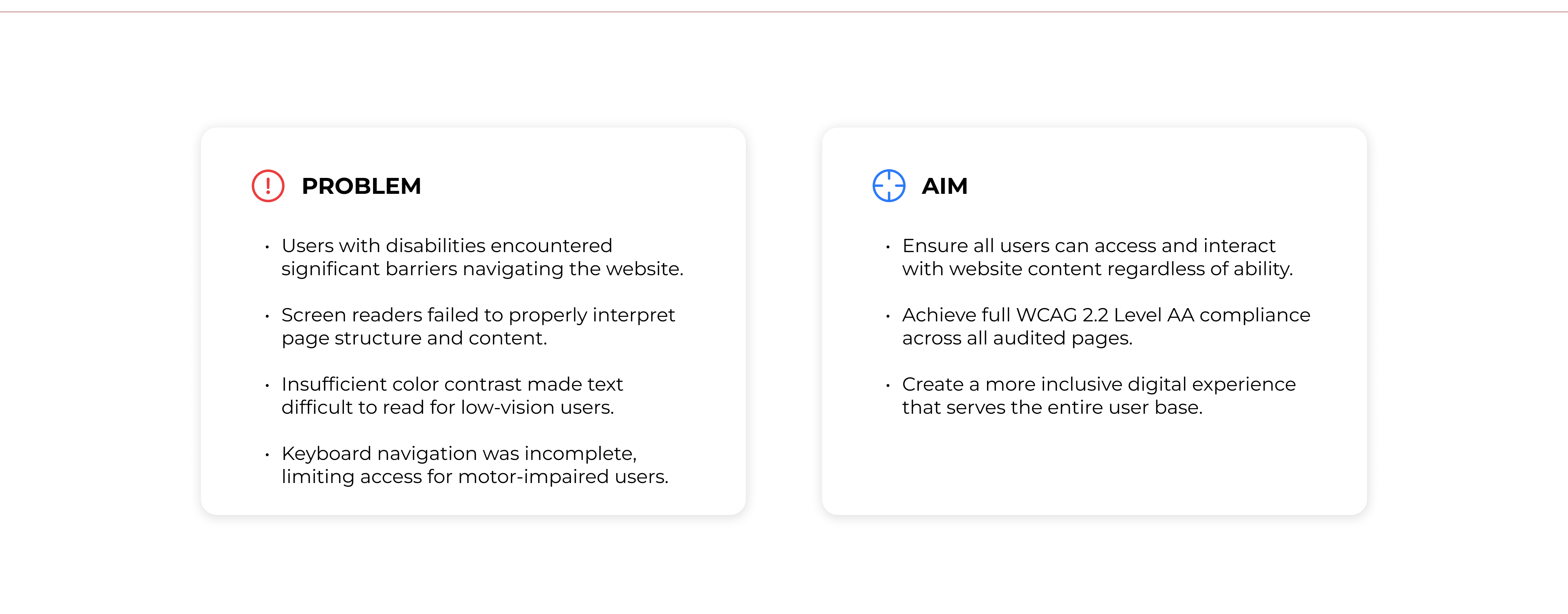
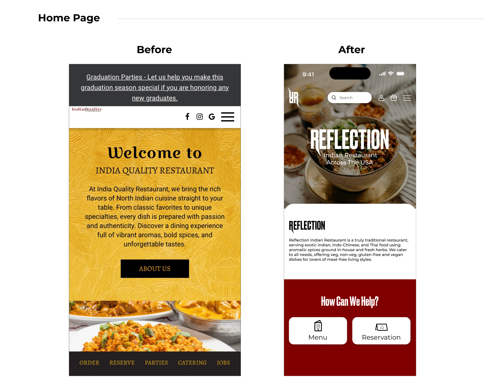
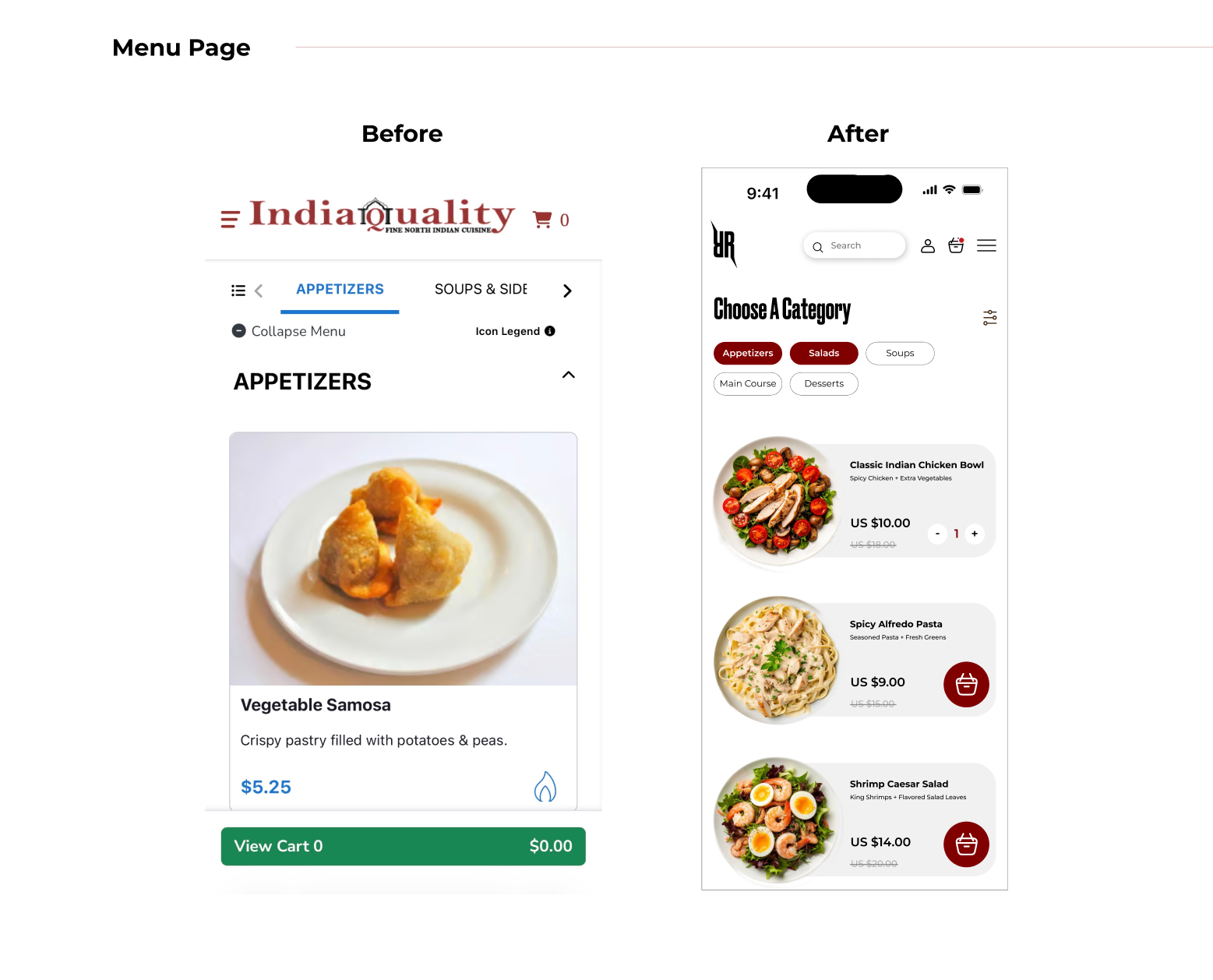
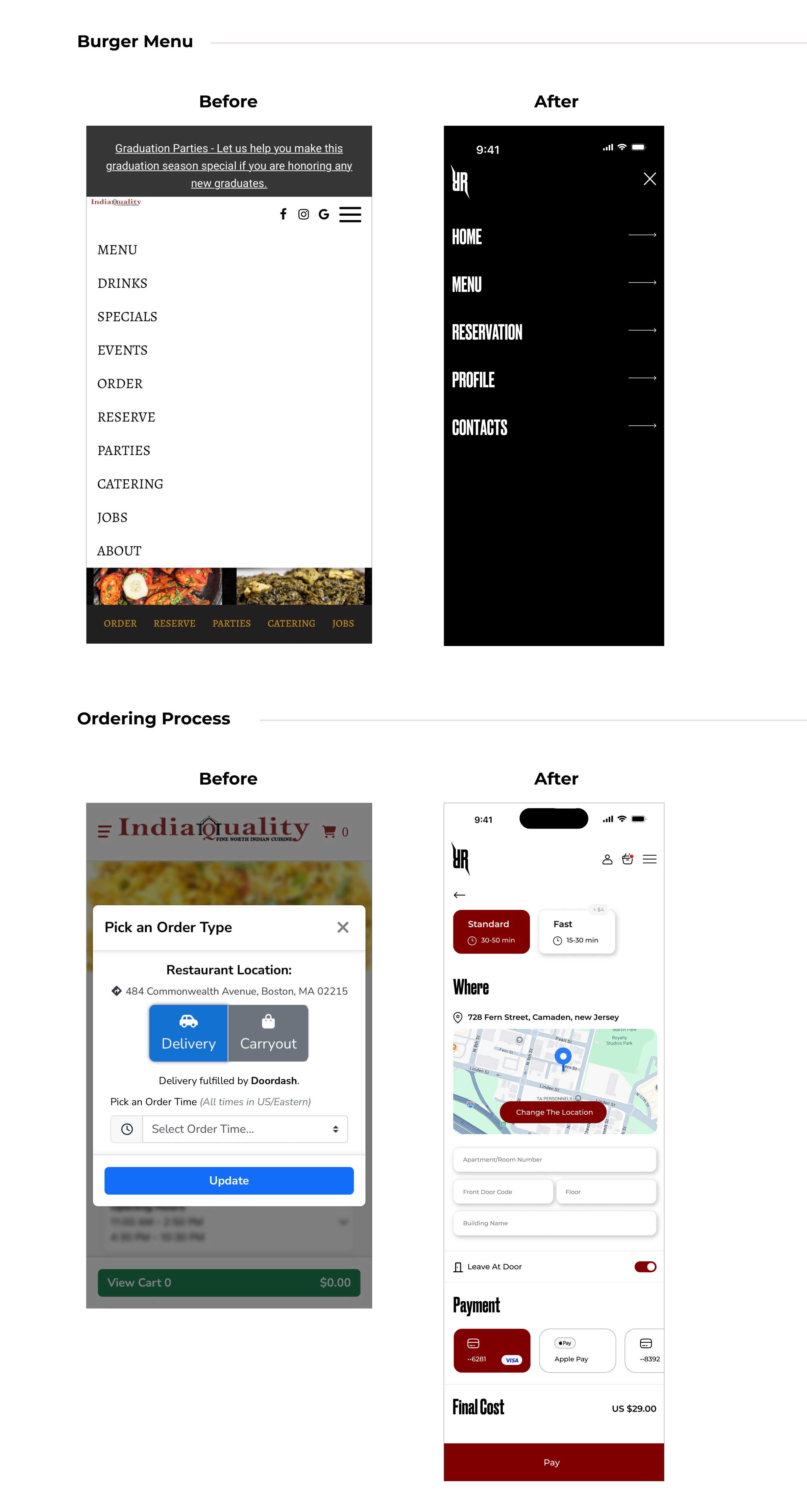
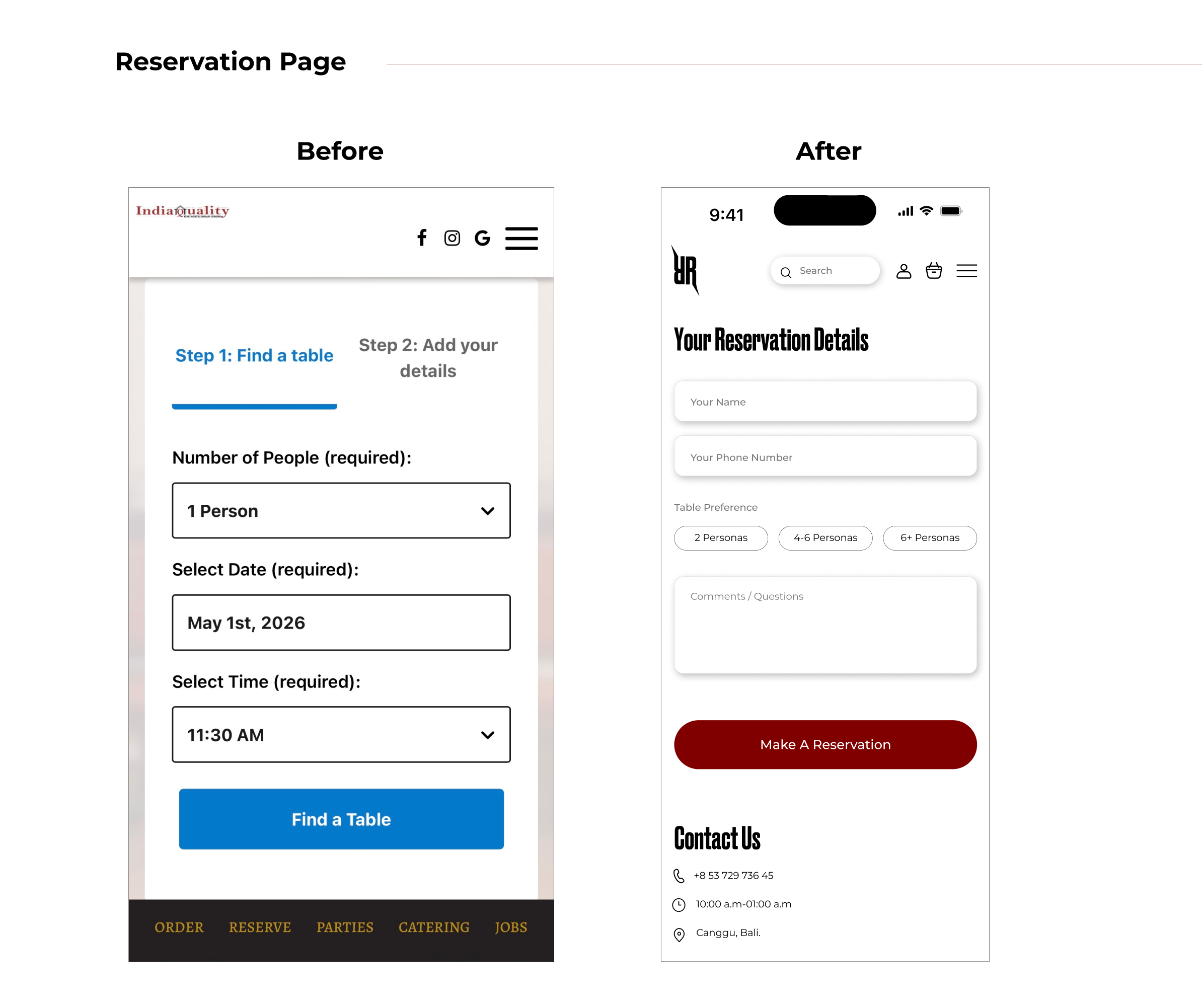
This project focuses on redesigning the Indian Restaurant Across The USA website with a strong emphasis on accessibility and inclusive user experience. The goal was to evaluate the existing website against WCAG 2.2 Level AA/AAA standards, identify accessibility barriers, and translate those findings into meaningful design improvements. Through a structured accessibility audit, low-fidelity wireframing, and high-fidelity prototyping, the project demonstrates how accessibility principles can be integrated into a real-world restaurant website without compromising visual quality or brand identity.
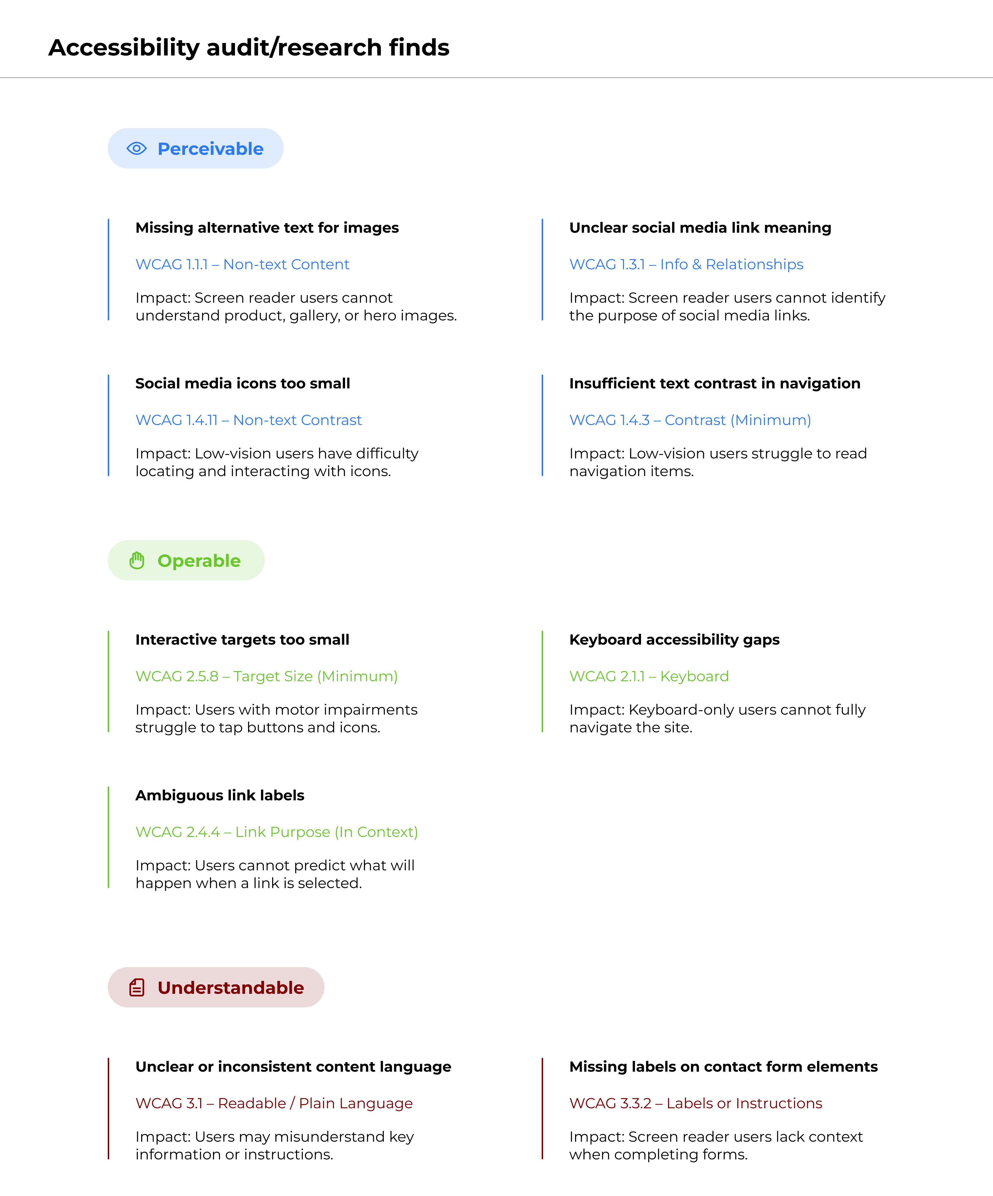
Accessibility Audit Findings & Analysis
I conducted a WCAG 2.2 Level AAA accessibility audit/research to identify usability barriers affecting users with disabilities. Key issues included missing alt text, low color contrast, unclear link labels, and small touch targets, primarily impacting screen reader, keyboard-only, and low-vision users. These insights directly guided the design decisions in both low- and high-fidelity redesigns.
Accessibility Audit Analysis
The audit showed that most critical issues fell under the Perceivable and Operable principles, creating barriers for users with visual and motor impairments. Repeated issues included missing alternative text, insufficient color contrast, low-contrast footer content, small interactive targets, and unclear social media links. Fewer issues appeared under Understandable, though missing labels still impacted assistive technology support. These findings guided the prioritization of high-impact accessibility improvements in the redesign.
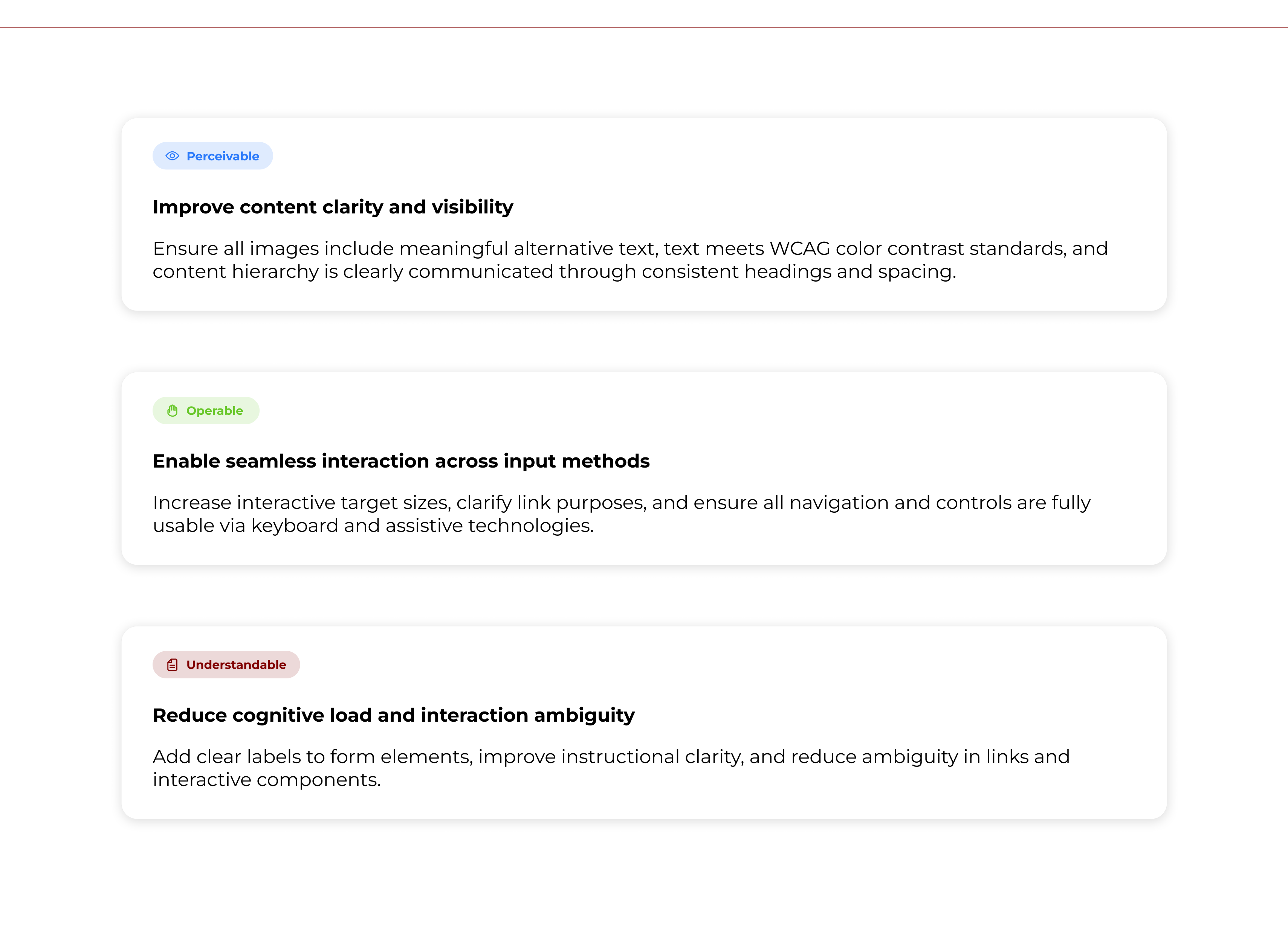
Design Goals
High Fidelity Wireframes
Accessibility Improvements & Validation
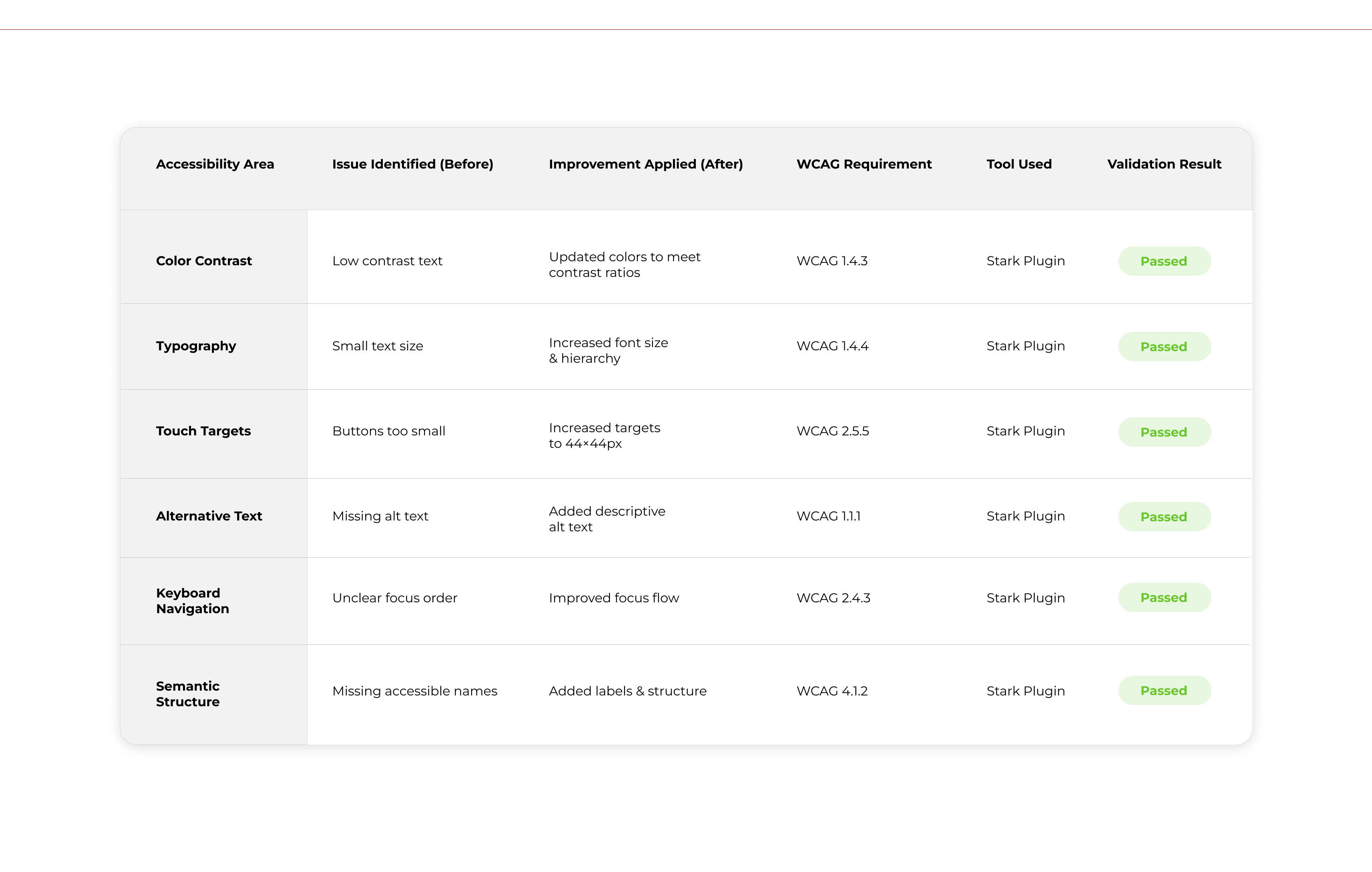
After redesigning the web app, I validated all accessibility improvements using the Stark Accessibility Checker in Figma. The final designs meet WCAG 2.1 AA standards across color contrast, typography, touch targets, and semantic structure. Key accessibility issues identified during the audit/research, such as low color contrast, small interactive targets, missing alternative text, and unclear focus order, were systematically resolved. As a result, the final interface offers a more inclusive, readable, and operable experience for users who rely on assistive technologies, keyboard navigation, and touch inputs.
Final Overview
This project improved accessibility and usability by addressing high-impact WCAG 2.2 issues across navigation, content hierarchy, contrast, and interaction patterns. The audit/research redesign reduced barriers for keyboard, screen-reader, and low-vision users while maintaining the site’s original business intent. It demonstrates my ability to translate accessibility standards into practical design decisions and build inclusive experiences at a system level.